
Key Takeaways
- Data visualization techniques can be grouped by purpose, including comparison, change over time, distribution, composition, relationships, and location.
- Different charts reveal different parts of the data. Bar charts compare categories, while histograms show distribution and scatter plots examine relationships.
- Choosing a technique depends on the question the visualization needs to answer and the structure of the data.
- A poorly chosen chart can hide the main finding or create a misleading impression. Common problems include crowded pie charts and distorted scales.
- Clear labeling and accessible color choices are just as important as selecting the right chart type.
Organizations collect data to learn what is happening and decide what to do next. Those decisions are made across the business, often by people who work with the same information in very different ways.
A table of figures may be clear to the analyst who prepared it but difficult for someone seeing it for the first time. Patterns that are buried in rows of data often become easier to understand when they are presented visually.
Data visualization techniques turn those figures into formats that are easier to understand, helping people compare results and see how values relate, change, cluster, or contribute to a whole.
Data Visualization Techniques, Grouped by Purpose
To choose a data visualization technique, start by deciding what you need the chart to show. You may want to compare categories, examine change over time, understand how values are distributed, or show how parts contribute to a whole.
The examples below show some common techniques and their purpose:
Comparison: showing differences across categories
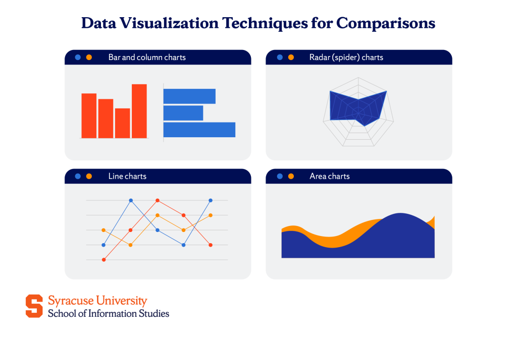
Comparison charts place separate categories against the same scale. This makes it easier to see which category has the highest value and how large the differences are.
Bar and column charts
Bar and column charts compare values by representing each category with a bar. Column charts use vertical bars, while bar charts arrange them horizontally.
A company might use a column chart to compare annual revenue across product lines. A horizontal bar chart may work better when the category names are long or when many categories need to be displayed.
Radar (spider) charts
Radar charts compare several measures for one item or a small number of items. Each measure has its own axis extending from the center, and the values connect to form a profile.
For example, a company could compare two products based on price, battery life, durability, and customer ratings. The chart belongs in the comparison group because it shows where each product performs better across the same set of measures.
Radar charts become difficult to read when too many items overlap. They work best when the number of profiles and measures remains limited.
Line charts
Line charts compare how values for different groups change over time. Each group is represented by a separate line, making it easier to see which one is higher and where their results begin to move apart.
For example, a marketing team could compare monthly website traffic across several campaigns. Line charts also make trends and turning points easier to identify, which is why they work especially well when the comparison involves time.
Area charts
Area charts compare how values change over time, with the shaded space below each line placing greater emphasis on volume. They can show which group contributes more and how that difference changes across the period.
Stacked area charts compare how several categories contribute to a changing total, such as revenue by channel across several quarters. They are useful for showing overall patterns, although exact differences between individual categories may be harder to judge.
Distribution: showing how values spread
Distribution charts show how individual observations are arranged across a range. They help reveal whether values are concentrated in one area or spread widely.
Histograms
A histogram divides a continuous variable into intervals called bins and shows how many observations fall within each one. This reveals the overall shape of the distribution.
For example, a company could group customer ages into five-year intervals. The resulting histogram would show which age ranges are most common and whether the customer base is concentrated or widely spread.
A histogram may resemble a bar chart, but the two serve different purposes. Bar charts compare separate categories, while histograms show how values from one continuous variable are distributed.
Box plots
Box plots summarize the distribution of a dataset in a compact form. They show the median and the middle portion of the data, while points beyond the expected range may be displayed as outliers.
A teacher could use box plots to compare test-score distributions across several classes. The chart would show which class had the higher median and which one had greater variation.
Box plots are useful for comparing distributions, but they do not show every feature of the data’s shape. A histogram may provide more detail when the pattern within one group is important.
Composition: showing parts of a whole
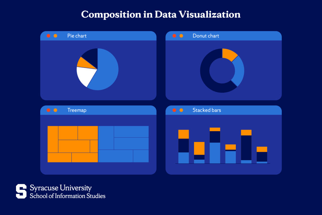
Composition charts show how individual categories contribute to a total. They are most useful when the relationship between each part and the whole is more important than the exact difference between categories.
Pie and donut charts
Pie and donut charts divide a total into slices, with each slice representing one category’s share. They work best when the categories are limited, and their proportions differ enough to compare visually.
A company might use a donut chart to show how its annual budget is divided between four departments. The chart makes sense in the composition group because every slice represents part of the same total.
These charts become harder to read when they contain many slices or when several values are similar. A bar chart usually provides a clearer comparison in those cases.
Treemaps and stacked bars
Treemaps represent parts of a whole through rectangles sized according to value. They can also place smaller rectangles inside larger groups, making them useful for hierarchical data.
For example, a treemap could show how a company’s budget is divided by department, with each department divided further by team. The viewer can see the largest areas without reading a long list of figures.
Stacked bars divide one bar into segments that represent parts of the total. When several stacked bars appear together, they can also compare how composition changes across groups or periods.
Relationship: showing how variables connect
Relationship charts examine how one variable changes in relation to another. They can help identify whether the variables move together or follow a more complicated pattern.
Scatter plots
Scatter plots position each observation according to two numerical variables. The pattern formed by the points can suggest whether higher values in one variable tend to appear with higher or lower values in the other.
A marketing team might plot advertising spending against conversions. The chart could indicate whether increased spending is associated with more sign-ups and reveal observations that do not follow the general pattern.
A scatter plot can show an association, but it does not prove that one variable caused the other to change.
Bubble charts and heatmaps
Bubble charts extend scatter plots by using bubble size to represent an additional value. For example, a company could compare revenue and profit across stores while using bubble size to show the number of customers.
Heatmaps use differences in color intensity to represent values within a grid. In a correlation matrix, they can show which variables have stronger relationships with one another.
These charts belong in the relationship group because they allow more than one dimension of data to be examined together. However, the scale and labels must remain clear so that color or bubble size does not become misleading.
Geospatial: showing data on a map
Geospatial visualizations connect values with physical locations. They are useful when location itself affects how the information should be interpreted.
Choropleth and point maps
Choropleth maps shade geographic regions according to value. A darker shade might represent a higher percentage or rate within a state, county, or country.
These maps generally work better with normalized measures, such as sales per resident, than with raw totals. Otherwise, highly populated regions may appear more important simply because more people live there.
Point maps place markers at specific locations. They are better suited to showing store locations, reported incidents, or other data tied to exact coordinates. The choice between the two depends on whether the analysis concerns an entire region or individual locations within it.
How to Choose the Right Data Visualization
The following questions can help you narrow the options:
- What is the purpose? You may need to compare categories, track change over time, examine a distribution, show composition, explore a relationship, or map location.
- What type of data are you using? Categorical data often suits bar charts, while continuous values may be better represented through line charts or histograms.
- How much data needs to appear? A chart that works for four categories may become difficult to read when it contains several dozen.
- Who will use the visualization? A chart created for your own analysis may include more detail than one designed to communicate a finding to a wider audience.
These questions connect directly to the purpose groups above. Once you know what the chart needs to communicate, you can focus on the techniques designed for that task.
When several options could work, choose the simplest one that answers the question clearly. A familiar bar or line chart is often more effective than a complex visual that requires additional explanation.
Best Practices and Common Mistakes
A chart should make the information easier to understand, not require the audience to work harder to interpret it. Good design keeps attention on the data, while poor choices can hide the main point or create a misleading impression.
Some of the best practices related to data visualization include:
- Focusing on one main message: Decide what readers should understand before selecting the chart. Remove details that do not support that purpose.
- Using clear labels: Include a descriptive title and label the axes where needed. Legends should identify each series without forcing readers to guess what the colors or symbols mean.
- Choosing an appropriate scale: The scale should represent differences accurately. Bar charts should usually begin at zero because bar length is used to compare values.
- Using color to aid understanding: Apply color to separate categories or draw attention to important information. Make sure the visualization remains understandable for people with color-vision deficiencies.
- Keeping the chart accessible: Use readable text and sufficient contrast. Add alt text that explains the chart’s main finding for people using screen readers.
Throughout the process, you should also keep an eye out for the following common mistakes people make:
- Using the wrong chart type: A chart may be visually appealing but poorly suited to the question. For example, a pie chart becomes difficult to read when it contains many similar slices.
- Distorting the scale: Truncated axes can make small differences appear much larger than they are. Any scale adjustment should be clear to the reader.
- Adding unnecessary effects: Three-dimensional shapes and decorative backgrounds can distort proportions or distract from the values being shown.
- Including too much information: Too many categories or overlapping labels can make a chart difficult to follow. Separate the information into multiple visuals when one chart becomes crowded.
Putting Data Visualization Techniques into Practice
Strong data visualization depends on more than choosing the right chart. Professionals also need to understand how data is collected and prepared before they can communicate the results accurately.
Syracuse University’s School of Information Studies (iSchool) offers an M.S. in Applied Data Science that develops these broader capabilities through study in data management and advanced analytics. Students can also pursue a Visual Analytics concentration with coursework in data visualization and analytic dashboard design.
The program is available online and on campus, allowing students to develop skills relevant to data analysis and other data-focused careers in a format that suits their circumstances.
Frequently Asked Questions (FAQs)
What is the difference between data visualization techniques and data visualization tools?
A data visualization technique is the method used to present information, such as a scatter plot or heatmap. A visualization tool is the software used to create it, and the same technique can usually be produced in several programs.
What are the best data visualization tools for beginners?
Spreadsheet software and no-code platforms such as Tableau Public, Power BI Desktop, and Looker Studio are common starting points. Matplotlib may suit beginners learning Python, while D3.js generally requires more experience with coding and web development.
When should you avoid using a pie chart?
Avoid pie charts when they contain many categories or several slices of similar size. A bar chart is usually clearer when readers need to compare values precisely.
How do you make data visualizations accessible?
Use sufficient contrast and choose colors that remain distinguishable for people with color-vision deficiencies. Do not rely on color alone, and include clear labels or patterns where needed. Alt text should explain the chart’s main finding for people using screen readers.
What is the difference between exploratory and explanatory visualization?
Exploratory visualizations help analysts examine data and identify possible patterns. Explanatory visualizations are designed to communicate a specific finding to an audience, so they usually contain less detail and stronger visual emphasis.
Do you need to know how to code to create data visualizations?
No. Spreadsheet software and no-code platforms can create many common charts. Coding is more useful when a project requires greater customization or interactive features.