
Key Takeaways
- Each data analytics tool serves a different purpose, and the best one depends on your needs and background.
- Visual tools such as Power BI, Tableau, and Looker Studio help users present and explore data without writing code.
- Tools like Python, R, and SQL are programming languages commonly used in data analytics.
We hear the word data constantly—businesses seem to always want more of it, websites track it, and various apps are built around it. But if you were handed a pile of raw data right now, just rows of dates, names, clicks, and numbers, it wouldn’t mean much. On its own, data is just noise. It becomes valuable only when someone knows how to work with it.
To work with data and extract meaning from it, professionals depend on various data analytics tools.
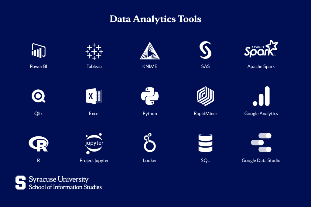
15 Data Analytics Tools
Different tools serve different purposes—some are perfect for beginners, and others are better suited for technical users or large teams. The following are some of the most widely used and best data analytics tools:
Power BI
Power BI is a Microsoft user-friendly tool that transforms data into interactive visuals like charts, graphs, and dashboards. It connects easily with Excel spreadsheets and other databases, making it especially convenient for businesses already using Microsoft products.
Power BI updates in real-time, so as your data changes, your visuals can, too. This makes it popular among business professionals as they can quickly spot patterns or make decisions without spending time looking through rows of raw data.
Tableau
Tableau is also primarily a visualization tool. It allows users to work with and combine data from many different sources. You can drag and drop data fields to rearrange their appearance and build dashboards that fit your needs.
Even with large or complex datasets, Tableau makes patterns and insights easier to spot through visuals like charts, heat maps, timelines, and interactive graphs. It’s especially good at helping you discover trends or relationships in your data that might be hard to notice in a spreadsheet.
KNIME
KNIME lets you work with data by connecting visual blocks on a screen instead of writing code. Each block serves a specific task, such as reading a file or doing calculations. This visual approach makes KNIME especially accessible for beginners and non-programmers.
This tool is widely used in fields like pharmaceuticals and manufacturing, where people often need to analyze complex data but aren’t skilled in coding.
SAS
SAS, which stands for Statistical Analysis System, is a powerful analytics tool widely used in industries such as healthcare, banking, and insurance. The reason why these fields in particular prefer SAS is because they often deal with private and sensitive information, like medical records or financial transactions, and therefore need tools that are very secure and dependable.
SAS is a trusted tool in the field of data analytics because it’s been around for decades and has built-in features that help companies follow strict legal and privacy rules. Although it uses its own coding language, which can take time to learn, many large organizations still use it because it handles complex, regulated data very well.
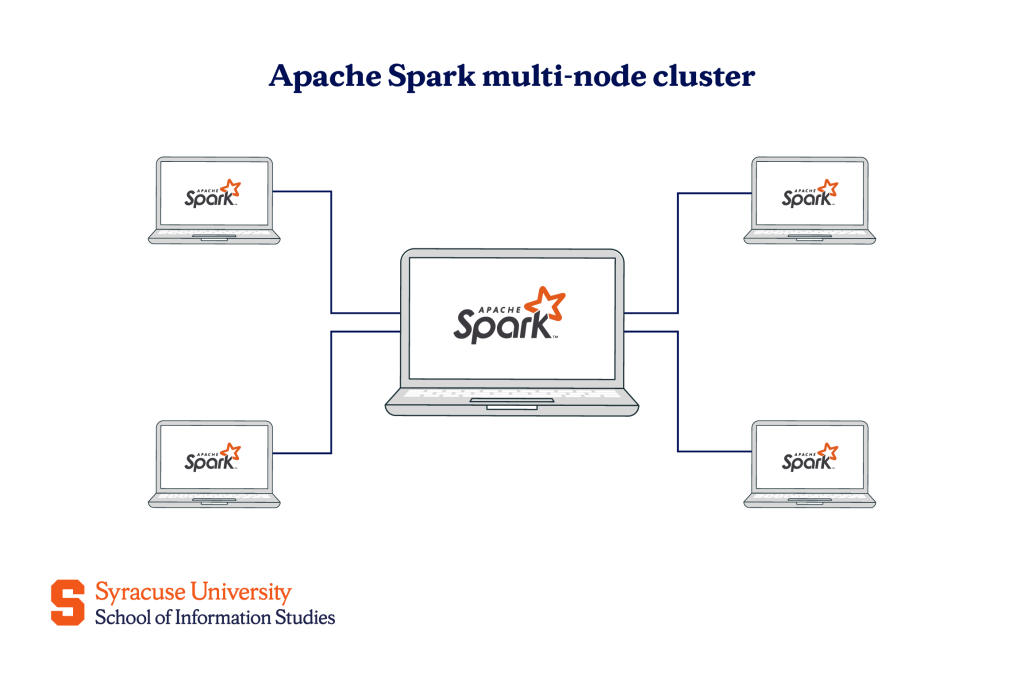
Apache Spark
Apache Spark is designed for handling massive datasets that go beyond what a regular computer can manage—for example when a company is collecting information from millions of users or devices at the same time. Instead of using one computer, Spark spreads the work across many computers, so it can process huge amounts of data quickly.
It’s not something you’d use directly to make graphs or reports, but it helps to clean, organize, and analyze the data that other tools (like dashboards or apps) use. That’s why it’s often used by engineers and large companies that deal with real-time data, like social media feeds or online shopping activity.
Qlik
Qlik, which includes QlikView and Qlik Sense, is a data analytics platform that allows users to explore data interactively. Instead of just showing a fixed graph, if you click on a part of the data, it automatically updates everything else to show how it’s connected.
This “associative” way of thinking helps people find answers they didn’t know they were looking for. It’s often used by businesses that want faster, more flexible insights from their data.
Excel
Excel is one of the most widely recognized tools in data analytics. It is a program that lets you type data into tables—like lists of names, numbers, or anything else you want to keep track of. But it certainly does more than just store information.
You can use it to perform calculations, create visualizations like bar or pie charts, sort and filter data, and build simple forms or templates for repeated tasks. It’s not the best tool for working with large amounts of data, but it’s very popular because it’s simple to use, and most people are already familiar with it. That’s why many beginners start learning data skills with Excel before moving on to more advanced tools.
Python
Python is a bit different from other data analytics tools like Excel or Power BI because instead of being a ready-made program where you click buttons, Python is a programming language that becomes a data analytics tool when you use it with special libraries.
You can use Python to clean up messy data, calculate statistics, create charts, or even build smart systems like recommendation engines (like what Netflix or YouTube uses). Since you’re writing the instructions yourself, you have a lot of control over exactly how things work.
RapidMiner
RapidMiner is a platform that, similar to KNIME, uses a visual interface to help users build data analysis processes without needing to code. It uses a visual, drag-and-drop interface where you can assemble workflows by connecting operators.
For example, if a business wants to predict which customers might stop buying their products, they can use RapidMiner to import customer data, process it, and apply machine learning algorithms to identify patterns—all through a graphical interface.
RapidMiner also offers features like Auto Model, which guides users through the process of building predictive models by automatically selecting the best algorithms and parameters.
Google Analytics
Google Analytics is a free tool developed by Google, and it remains one of the most widely used platforms for understanding website performance.
It gathers detailed information about how visitors interact with your site, including how they arrive (whether it is through search engines, online ads, email links, or social media platforms), which pages they visit, how long they stay, what content they click, and where they exit. This information is then presented in user-friendly dashboards and reports, making it accessible even to those without a background in analytics.
R
R is a programming language that people can use to work with numbers and study data in detail. It is similar to Python in that both are used to analyze data and create visualizations, but R was built specifically for statistical analysis and is often preferred in academic and research settings.
R includes ready-made features that make it easier to work with organized tables of data, carry out advanced types of analysis, and create summaries that explain the results.
Project Jupyter
Project Jupyter is a tool that functions like a digital notebook, where you can write code and see the results immediately below. Along with the code, you can include written explanations, images, or charts, which helps keep your work clear and well-documented. This makes Jupyter especially helpful for people who want to combine technical work with written reasoning in one place.
It’s widely used with programming languages like Python or R and is a common choice for students, researchers, and professionals who need to experiment with data while keeping a clear record of their process.
Looker
Looker is similar to Power BI and Tableau because it helps you understand your data by turning it into visuals like charts, tables, and dashboards. However, unlike many platforms that require you to upload data, Looker connects directly to your existing data sources, allowing real-time access without duplication.
Looker also lets teams set clear rules about how the data should be used, so everyone sees the same results, and there’s less confusion. It works well for companies that work with a lot of changing data and want accurate answers at any time.
SQL
SQL stands for Structured Query Language. It’s a language used to access data stored in databases, which many organizations rely on to keep their information organized.
SQL helps you pull out exactly the data you’re looking for. For example, if you want to check how many orders were placed yesterday or search for all customers from a certain city, SQL lets you type simple instructions to find that information.
Instead of clicking buttons or using charts, SQL works by typing commands. It’s widely used in industries that rely on organized data because it helps people quickly search, filter, and combine information.
Google Data Studio (Looker Studio)
Google Data Studio, now called Looker Studio, is a free tool from Google that allows users to present data in a visual, easy-to-understand format. You can connect it to sources like Google Analytics, Google Sheets, or BigQuery, and it will pull in the latest information to build reports that update automatically.
Despite the similar name, Looker Studio is not the same as Looker. Looker Studio is much simpler and designed for creating reports without needing to code or set up complex data models.
How to Choose a Data Analysis Tool
Seeing as how there are so many data tools available when you begin learning about data analytics, it’s easy to feel overwhelmed. But the important thing to keep in mind is that you don’t need to know all of them. You just need to find the one (or few) that match what you’re trying to do.
To help guide your decision, think about the following questions and suggestions:
- What types of data do you work with?
- If you’re dealing with website traffic, tools like Google Analytics and Looker Studio are a great fit.
- For business data like sales, customer information, or inventory, consider Power BI, Tableau, or Qlik.
- If your data is large and constantly changing, or you work in a technical field, you may need tools like Apache Spark or Looker.
- Do you prefer using a visual interface or writing code?
- If you like drag-and-drop interfaces with no coding required, tools like KNIME, RapidMiner, Power BI, and Looker Studio are good options.
- If you’re comfortable (or interested) in learning code, Python, R, and SQL give you more flexibility and control.
- Are you working alone or as part of a team?
- For solo work or small teams, tools like Excel, Google Data Studio (Looker Studio), or Tableau Public are easy to use and quick to set up.
- For larger teams or organizations that need consistency, tools like Looker, Power BI Pro, or SAS may be better because they support shared data rules and access control.
- How important is real-time or up-to-date data?
- If you need data that stays current without manual updates, go for tools that connect directly to live data sources, such as Looker, Looker Studio, or Power BI with live connections.
- If you’re okay with refreshing data yourself, Excel, Tableau, and others also work well.
- What’s your main goal?
- If it’s to present data clearly to others, then use Looker Studio, Power BI, or Tableau.
- If it’s to analyze patterns and make predictions, you should look into RapidMiner, KNIME, Python, or R.
To manage or search through large databases, you’ll likely need SQL or Apache Spark.
Conclusion
One of these tools might be the perfect fit for one person, while a different one works better for someone else. But that’s exactly the point. These tools each have their strengths, and what’s “best” depends on what you’re trying to do. The right tool will be the one that helps you move forward. So, start with one that matches your current goals, and allow yourself the freedom to grow from there.
That growth comes more naturally—and easily—when you’re learning in the right environment. At Syracuse University’s iSchool, our Applied Data Analytics Bachelor’s Degree is built to introduce you to the tools, skills, and ways of thinking that define this field. If you’re majoring in something else but still want to build that foundation, our Applied Data Analytics Minor is a smart way to sharpen your analytical edge.
Wherever you start, we’ll help you build the understanding you need so you’re never intimidated by a new tool—and always prepared to choose the one that makes your work smarter.
Frequently Asked Questions (FAQs)
How do I choose the right data analytics tools for my business?
Start by considering the type of data you work with, how you prefer to interact with it (visually or through code), and whether you need real-time insights or predictive capabilities.
What are common challenges data analysts face when integrating new tools?
They often face issues with system compatibility, data formatting, and needing time to learn how to use the new tool effectively.
What are the 4 types of data analysis?
They are descriptive (summarizing what happened), diagnostic (understanding why it happened), predictive (forecasting what could happen), and prescriptive (suggesting what to do next).